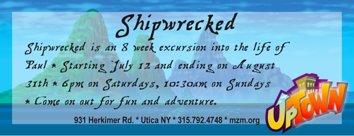
First, I don’t know your audience of children and where they come from, but do you think you need the part about “the life of Paul”? With the children in our church that info wouldn’t have any drawing point.
But you’ll know what draws/interests your children.
Sorry I am late to the show. I maybe to late and if I am I do apologize but I thought I would give you the feedback anyway.I like the use of the background that they give you in Elevate. It will bring some familiarity to the kids. I like the Logo placement of Uptown and the church info placement. Things I am not crazy about: The fonts on the front and back should match I think. I am not a fan of the Shipwrecked font in general. I would also have the front and back match a little bit more. So there you have it. Again sorry it is so late.
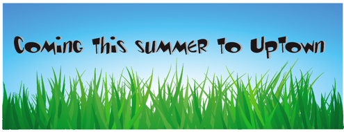
How ’bout replacing the word uptown on the “Coming This Summer” side to the logo uptown?
It looks great!
How ’bout replacing the word uptown on the “Coming This Summer” side to the logo uptown?
It looks great!
First, I don’t know your audience of children and where they come from, but do you think you need the part about “the life of Paul”? With the children in our church that info wouldn’t have any drawing point.
But you’ll know what draws/interests your children.
I think that the font is pretty hard to read. It is very wordy but the background is cool. I would be great if you could get the words to pop.
Thanks for your feedback guys it really helps!
Sorry I am late to the show. I maybe to late and if I am I do apologize but I thought I would give you the feedback anyway.I like the use of the background that they give you in Elevate. It will bring some familiarity to the kids. I like the Logo placement of Uptown and the church info placement. Things I am not crazy about: The fonts on the front and back should match I think. I am not a fan of the Shipwrecked font in general. I would also have the front and back match a little bit more. So there you have it. Again sorry it is so late.