One of my pet peves in kids ministry is that we design below the intended age we are trying to reach. I am not sure why we do this. Personally I think it happens because we wrongly target the lowest age kids in the demographic we are trying to reach, or we are just out of touch from the main stream of design because are to busy ripping off real logos to companies to make Jesus junk shirts like taking the coke logo and changing it to say Jesus Christ “He’s the real deal”. In the church world we rip stuff off instead of using design ideas from what is hot now to help guide the direction of what we want to create. (where do I go for inspiration for kidmin design pieces? nick, Disney, Disney XD, ) Drives me nuts. Ok I am stepping off my soap box now.
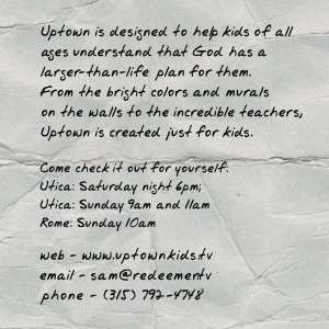
I thought I would share a touch card I made yesterday and share some of my rules for designing stuff for kids ministry.
(This is the front)
(This is the back)
Here are a few of my rules for kidmin design:
1. Know the purpose of the piece
2. Content is king – what you say is more important than how it looks
3. Aim higher age than your intended audiance
- – For Preteen think Highschool
- – Elementary think Jr High
- – Pre-school think elementary
4. You need to have white space
I designed this piece for parents to have something to give to their friends. We are going to make Uptown stickers and buttons, because I want kids to take our logo with them into school. We can’t be in the school but we can design some cool stuff that every kids would want to bring in the school with them. What are some other things we should print so kids can take our stuff into the schools with them?


just had this topic come up in our creative meeting this week. Excited for comments.
A few that we talked about specifically for preteens:
Custom silly band (don't even know if that's possible)
T-shirts
livestrong bands with our branding
nerf ball
lunch pail
ipod case or sock
I was going to blog about this very thing today. So expect some link swag headed your way my man.
Great ideas JC totally what I was looking for. We though custom silly bands but have no idea how to make them so if you find out do share. I think the first thing we are going to do is a custom water bottle. I did livestrong bands for our camp they were cheaper than I thought they would be.
Share your sticker and button resource with us! We've looked at much of the same thing!
You're dead on. I think targeting the wrong audience is a much bigger problem than just design by the way. I think many have the same issue with their teaching and end up targeting too young. Also, kudos to you for mentioning white space. I cringe when I see fliers, etc. so jam packed with information and noise filling every bit of space on the page. It gets to the point where I really don't feel like investing time in deciphering it at all. If I want to read a book, I'll pick up a book. Just give me the essential information, and I'll be OK.
Couldn't agree more. We need to target the above who we are ministering to. Kids ministry is notorious at aiming to low. Great thoughts Wayne.
agree with you agreeing on the white space. Plus one for you!
I handed a kid a card with our logo the other day and he said, "Cool, is it a tattoo?"
Sadly it wasn't but it's a good idea I'm looking into.
Nice design Sam
Great ideas!
Aiming older is always something I've tried to do, kids want to be older then they are, so they respond to what they think older kids want, particularly pre-teens, and pre-pre teens… is there a word for that yet?
Hey bro!
You are one passionate dude and that's awesome because it's unto the Lord.
"– Pre-school think elementary" Hmmmmm, I'll have to keep that in mind!
Pingback: The Children’s Ministry Blog Patrol (September 2010) | Dad in the Middle